
This page is a draft at this point. Its goal is to hold all info about diagramming, that we think is valuable for our customers. Subscribe to the page if you want to stay in the loop.
This research page may contain unfinished or unconfirmed info!
This is a research page. Seibert Media uses research pages to prepare relevant topics and gather information about stories we want to run. Such research pages often evolve over a long period of time without quality assurance and cross-checking from our business experts. While all web content should be consumed cautiously, this page may still contain unconfirmed or unfinished information. Please use the live chat or a contact form on this page to help us improve it. Please ask us if you're unsure. We're happy to help if we can. Your interaction also helps us gauge interest in this research page, so don't hesitate to contact us.
Keywords: Diagramming, Diagrams in UML, Information visualization
Visualization
Visualization is any technique for creating images, animations, or diagrams to communicate a message. Since the beginning of time, visualization through visual imagery, has been an essential form of communication when it comes to communicating abstract or concrete ideas. Throughout history, visualization is seen from cave paintings, Greek geometry, to Egyptian hieroglyphs. Just as its use cases expand time and space, today visualization has an ever expanding application in science, education, engineering, multimedia, medicine, computer graphics, etc. Visualization is a powerful tool. The process of generating visual mental imagery with your eyes open or closed, is known as creative visualization, which goes back to the notion of a "mind's eye."
The use of visualization to present information is not a new phenomenon, it has been used since the dawn of time in maps, data plots, and scientific drawings. Examples include Ptolemy's Geographia (2nd century AD), a map of China (1137 AD), and Minard's map (1861) of Napoleon's invasion of Russia. Many of these visualizations carry over to computer graphics. The recent emphasis on visualization started in 1987 with the publication of Visualization in Scientific Computing, a special issue of Computer Graphics.
Decision making increasingly relies on data, often in large volume that is cannot be comprehended without a layer of abstraction, such as a visual representation. However even information that is not statistically demanding may require visual expression. Visualization that uses data is known as data visualization. Data visualization has its roots in the field of statistics and is considered a branch of Descriptive Statistics, although it is often argued to be an art and a science.
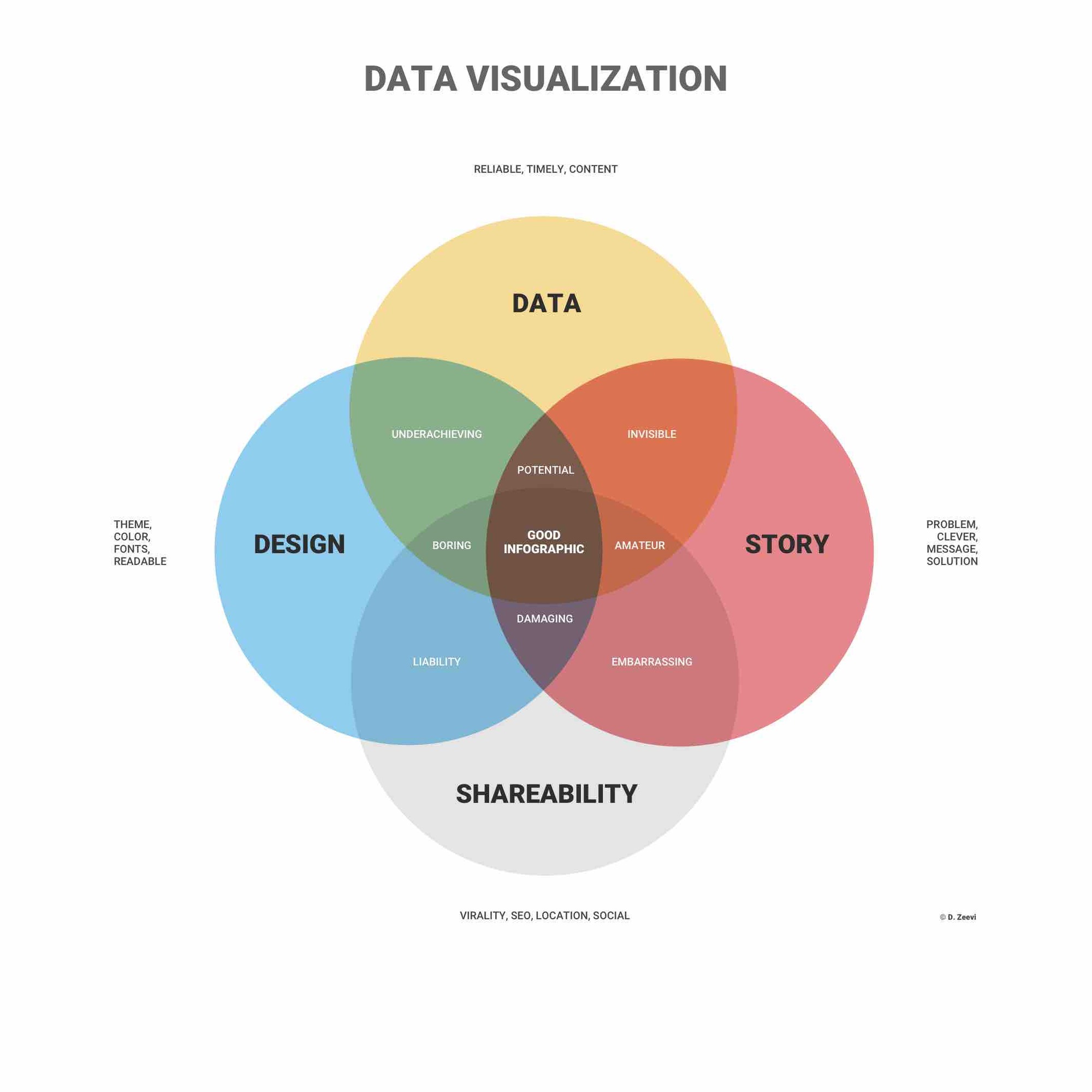 source: Infogram.com
Thanks to the internet and a growing number of affordable tools such as draw.io, translating information into visuals is now easy for everyone, regardless of data skills or design skills. However, all visualization should begin by answering two questions to ensure that convenient isn't replacing quality.
The first question refers to what you have- Information is either visualized as qualitative information (ideas) or plotted as quantitative information (statistics). This refers to the information itself rather than the visual form that is used to represent it. The second question refers to what you are doing- either communication information (declarative) or trying to figure something out (exploratory). Many managers work with declarative visualization, however explanatory visuals are used to confirm or refute a hypothesis or mind for more patterns or trends. These questions combined reveal that there are four types of visual communications.

source: Harvard Business Review
Short link to main page: https://seibert.biz/diagrams
Resourceful Links
Visualization
- Power of visualization
- Visualization Habits
- Visualization use case: Engineering UML
- Visualization use case: sales funnel diagram
- Visualization for Presentation
General Draw.io resources
- Draw-io app official homepage & more information about creating diagrams within Confluence and Jira
- Draw-io access to free trial for draw.io within Confluence and Jira
- Draw.io Help Desk for questions and concerns
- Draw.io official blog relevant and interesting articles regarding draw.io
- Draw.io interactive tutorials
- Draw.io media library